
Your website's words might be compelling, but if visitors get lost, they won't become leads. Learn how intentional structure and user flow build clarity and trust, guiding prospects before they read a single word.
The Silent Sales Force: What Your Website’s Structure Says (Without a Single Word)

Many service businesses pour energy into crafting persuasive website copy, agonize over stunning visuals, and meticulously detail their services. Yet, a critical element often gets overlooked: the website’s fundamental structure and how it guides a visitor. Think of it like a physical store. You can have the finest products, but if the aisles are confusing, the checkout is hidden, and there’s no clear path from the entrance to what you’re selling, customers will walk out. Your website operates the same way. Its architecture—the way pages are organized, linked, and presented—is your silent guide, either directing visitors toward a clear next step or sending them back to the search results.
This isn’t about flashy design trends or complex jargon. It’s about practical, human-first navigation that builds clarity and trust from the moment someone lands on your page. By focusing on intentional structure, you can guide passive visitors into becoming active, qualified leads—not by shouting louder, but by making the path to engagement clear and effortless.
From Clutter to Clarity: Designing for Intuitive Navigation
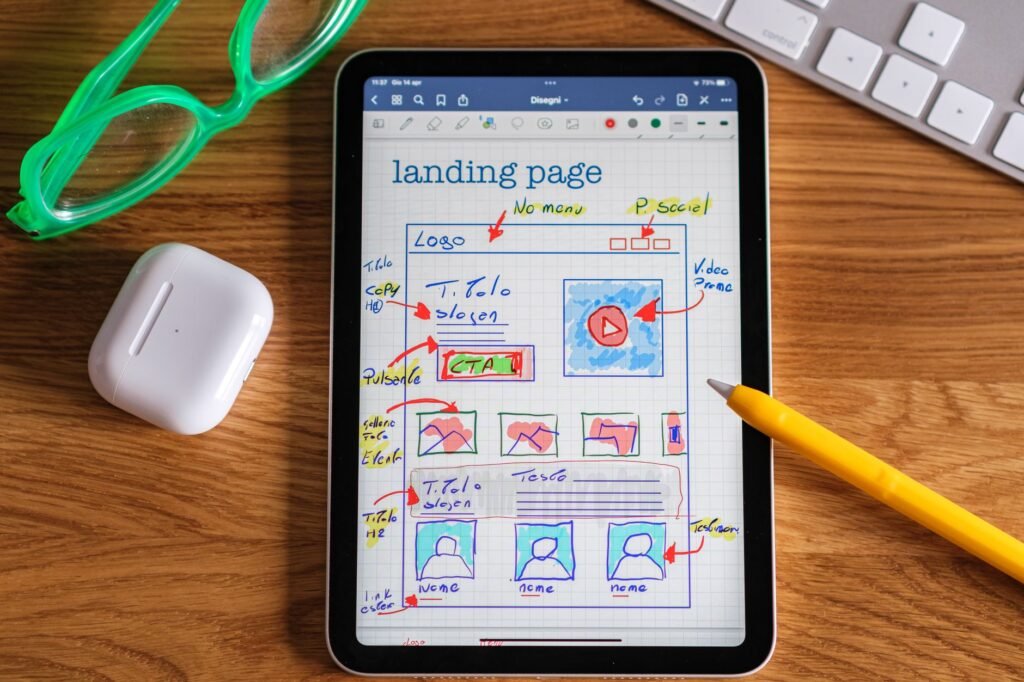
The first impression your website makes isn’t solely through its aesthetics or your service descriptions. It’s how easily someone can understand what you do and find what they’re looking for. A cluttered, illogical structure creates friction, forcing visitors to think harder than they want to. This cognitive load can quickly lead to frustration and a swift exit. The goal is to create a user flow that feels natural, almost subconscious.
Key Structural Elements for Clarity:
- Logical Information Architecture: Group related services and information intuitively. A client looking for ‘web design’ shouldn’t have to hunt through unrelated blog posts or obscure sub-menus.
- Clear Primary Navigation: Your main menu should be concise and directly reflect your core offerings. Use straightforward labels that your target audience understands.
- Strategic Internal Linking: Connect relevant pages within your site. If you discuss a specific service on a landing page, link directly to that service’s detailed page. This helps users explore and search engines understand your site’s topical depth.
- Visible Calls to Action (CTAs): Don’t hide the next step. CTAs should be prominent and clearly indicate what action the user should take (e.g., ‘Get a Quote,’ ‘Learn More About X,’ ‘Book a Consultation’).
Consider how a visitor arrives. Are they landing on your homepage, a specific service page, or a blog post? Your structure needs to accommodate all these entry points, providing immediate context and a clear next step, regardless of where they start their journey.
Inline Image Prompt 1: A clean, modern desk with a laptop displaying a well-organized website navigation menu. Soft, natural light illuminates the scene, with a notebook and pen nearby, suggesting thoughtful planning.
Building Trust Through Predictable Paths
Trust is the bedrock of any successful business relationship, and your website plays a pivotal role in establishing it. While compelling content builds credibility, a well-structured website builds trust by demonstrating professionalism, competence, and user-centricity. When a website is easy to use, information is readily accessible, and the user feels in control, it signals that you understand and respect their needs.
How Structure Fosters Trust:
- Consistency: A consistent layout, navigation, and use of visual cues across all pages reassures visitors that they are still on your legitimate site and know what to expect.
- Accessibility: Making information easy to find (contact details, service explanations, pricing if applicable) shows transparency and a commitment to customer service.
- Reduced Ambiguity: A clear structure minimizes the chances of users encountering dead ends or irrelevant information, preventing frustration and reinforcing a sense of reliability.
- Professionalism: A well-organized website reflects a well-organized business. It suggests attention to detail and a mature operational approach.
Think about the journey of a potential client. They are evaluating your business. A confusing website can plant seeds of doubt: ‘Are they disorganized?’ ‘Do they really know what they’re doing?’ Conversely, a site that guides them smoothly, answers their implicit questions through its organization, and makes it easy to take the next step, builds confidence and moves them closer to becoming a lead.
Inline Image Prompt 2: A close-up shot of hands sketching a website wireframe on a large notepad. The sketch shows a clear user flow with distinct sections and call-to-action buttons. The background is slightly blurred, focusing attention on the planning process.
From Browsing to Business: Designing an Intentional User Flow
The ultimate goal of your website’s structure is to facilitate genuine inquiries and new business. This means designing a user flow that doesn’t just present information, but actively guides visitors toward desired actions. It’s about anticipating their needs and making the path to becoming a lead as frictionless as possible.
Designing for Conversion Flow:
- Map Key User Journeys: Identify the most common paths a potential client will take. For a service business, this might be finding a service, understanding its benefits, and then inquiring.
- Place CTAs Strategically: Don’t just put a CTA at the bottom of every page. Integrate them contextually where a user is most likely to be ready for the next step.
- Simplify Forms: If your conversion point is a contact form, ensure it’s as short and straightforward as possible. Ask only for essential information.
- Create Dedicated Landing Pages: For specific campaigns or services, use dedicated landing pages with a single, clear objective and CTA, free from distracting navigation.
A website that prioritizes structure and user flow is not just a digital brochure; it’s a sophisticated tool that works for your business. It reduces guesswork for your visitors, builds inherent trust, and systematically moves people from initial interest to tangible inquiry. By focusing on the ‘how’ your website guides, you ensure that the ‘what’ you offer is clearly understood and acted upon.
Ready to ensure your website’s structure is actively converting visitors into opportunities? Let’s build a clearer, more effective digital experience for your business. Explore our Website Design and Development services or get in touch to discuss your project.